The trick to viewport units on mobile
DigitalOcean provides cloud products for every stage of your journey. Get started with $200 in free credit!
Viewport units have always been controversial and some of that is because of how mobile browsers have made things more complicated by having their own opinions about how to implement them.
Case in point: should the scrollbar be taken into account for the vw unit? What about a site’s navigation or page controls — should those count in the calculation? Then there are physical attributes of the devices themselves (hello, notch !) that can’t be overlooked.

First, a little context
The spec is pretty vague about how viewport units should be calculated. With mobile devices, we’re often concerned with the vertical height, so let’s look specifically at viewport height ( vh ):
vh unit Equal to 1% of the height of the initial containing block.
So yeah, no clear guidance there when it comes to handling device and browser-specific differentiations.
vh was initially calculated by the current viewport of your browser. If you opened your browser and started to load a website, 1vh was equal to 1% of your screen height, minus the browser interface.
But! If you start scrolling, it’s a different story. Once you get past a piece of the browser interface, like the address bar, the vh value would update and the result was an awkward jump in the content.
Safari for iOS was one of the first mobile browsers to update their implementation by choosing to define a fixed value for the vh based on the maximum height of the screen. By doing so, the user would not experience jumps on the page once the address bar went out of view. Chrome’s mobile browser followed suit around a year ago .
As of this writing, there is a ticket to address this in Firefox Android .
While using a fixed value is nice, it also means that you cannot have a full-height element if the address bar is in view. The bottom of your element will be cropped.

CSS Custom Properties: The trick to correct sizing
The idea struck me that CSS Custom Properties and a few lines of JavaScript might be the perfect way to get the consistent and correct sizing I needed.
In JavaScript, you can always get the value of the current viewport by using the global variable window.innerHeight . This value takes the browser’s interface into account and is updated when its visibility changes. The trick is to store the viewport value in a CSS variable and apply that to the element instead of the vh unit.
Let’s say our CSS custom variable is --vh for this example. That means we will want to apply it in our CSS like this:
OK, that sets us up. Now let’s get the inner height of the viewport in JavaScript:
We told JavaScript to grab the height of the viewport and then drilled it down into 1/100th of that total so we have a value to assign as our viewport height unit value. Then we politely asked JS to create the CSS variable ( --vh ) at the :root .
As a result, we can now use --vh as our height value like we would any other vh unit, multiply it by 100 and we have the full height we want.
There is another fix for this that has come along more recently. Matt Smith documents it here . The trick is min-height: -webkit-fill-available; on the body as a progressive enhancement over 100vh , which should work on iOS devices.
Whoa, there! One more little detail.
While our work might look done at this point, those of you with an astute eye for detail may have caught that the JavaScript fires but never updates the size of our element when the viewport’s height changes. Go ahead and try resizing the demo above.
We can update the value of --vh by listening to the window resize event. This is handy in case the user rotates the device screen, like from landscape to portrait, or the navigation moves out of view on scroll.
⚠️ Updating the value of --vh will trigger a repaint of the page and the user may experience a jump as a result. Because of this, I’m not advising that this trick should be used for every project or to replace all usage of the vh unit but only when you may need your users to have an exact viewport unit value.
Also, you may want to implement a debounce method for the resize event to avoid triggering to many events while the user is resizing their browser’s window. You can learn more about it with this article: Debouncing and Throttling Explained Through Examples
You can now resize the demo above and notice that the CSS variable is updated accordingly.
While I recently used this technique on a project and it really helped, you should always think twice when replacing the browser’s default behaviors. (For example, this comes up a lot with ::focus .) Also, browsers tend to update very fast these days, so beware that today’s solution may not work tomorrow.
In the meantime, I hope this article helps! 👋
Here’s a proposal for vhc and vwc units that may be a savior in all this.
You should really use some kind of throtteling when listening to the resize event especially if it is triggering a repaint — for example like documented here: https://devdocs.io/dom_events/resize
Thanks for your feedback, I added a small note the debounce technique but I didn’t want to add extra code into the demos to keep them clear ✌️
Haven’t tried that yet but I struggled with that problem for months! Thank you very much will try this to fix my website soon.
Could you elaborate your use case? You need an in-flow full-height element at the top of the page?
I’ve read somewhere (I think, on nngroup.com) that it’s best to make such an element slightly smaller, so that the user knows that they can scroll down. (Apparently, some users will assume that there is no content below.)
That’s exactly the use case where I needed it. The first screen of the website was supposed to be full-height on mobile but we got the bottom cropped (which was the client’s logo). You could also use this trick if you have a modal that should be 100vh and you don’t want your users to loose the bottom part because of the browser’s interface.
I was struggling with this exact issue a month ago and came up with similar solution :D
I wasn’t doing –vh in root but in that element that needed vh unit only and with jQuery as the project was in jQuery. But the concept is the same.
Similar fix width modal overlay, when body tag overflow hidden:
in js: function getScrollbarWidth() { return window.innerWidth – document.documentElement.clientWidth; } document.documentElement.style.setProperty(‘–scrollbar-width’, ${getScrollbarWidth()}px );
in css: body.modal-opened { padding-right: calc(var(–scrollbar-width)); }
Just a side node – probably it’s better to call variable –vh100, as long it is “100vh”, not a single unit.
If you only need full-height elements, yes you could skip the calc part and set the variable to 100% of window.innerHeight. But if you need an element to be 50vh or else, you can use the variable and multiple it like so: height: calc(var(--vh, 1vh) * 50);
A really nice solution.
However there is a problem – if any script execution fails, JS fails to load or loading takes a long time, you’re going to have an unusable site.
Add a .js class to the body and make the calc height apply only when JS has loaded – The 100vh is both the fallback and non-js/slow loading version
There is already a fallback in the CSS in case the JavaScript doesn’t run. In this line: height: calc(var(--vh, 1vh) * 100); there is var(--vh, 1vh) where 1vh is a fallback. This is not really mentioned in the article but CSS Custom Properties can have fallback if the property is not defined. You can read more about this here: https://developer.mozilla.org/en-US/docs/Web/CSS/var You could also add a default value on the root in your CSS.
I use the following code, never had an issue with 100vh not actually occupying the whole height.
This gets rid of the default behaviour. To me it looks like the issue you are having is caused by it.
After that IIjust manually add margins and padding as needed.
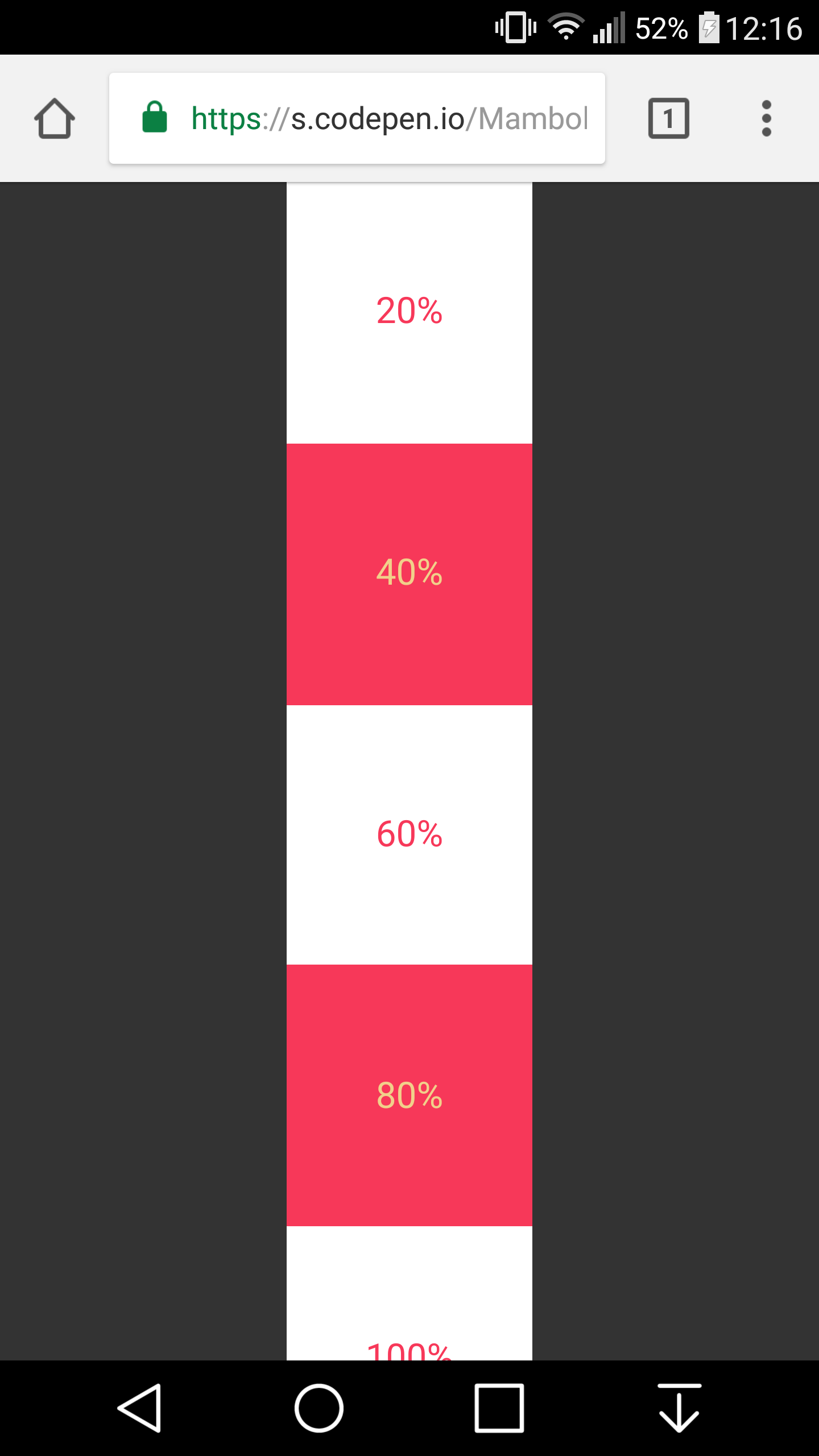
I got that working on chrome on my mobile device, but it is not working for Safari :(
Louis, please ignore my first comment, after looking into issue myself I have discovered more than I had hoped for. I always assumed that viewport height would be.. you know viewport height. Not the the mess it actually is.
So I have been researching a bit.. it appears that only solution that is somewhat reliable is the one you write about in your post maybe with some media queries… I am currently looking into it.
Meanwhile I made a little demo which seems to work fine, sort of… Ill try to use orientationchange event listener to handle the change of orientation and manually adjust height of pages which are below first 2 screen heights, because the URL bar will be always hidden at that point.
http://www.patriklegard.com/app
THANK YOU – this issue has irritated me for ages, and it seems obvious now but it actually never occurred to me to solve the problem this way using innerheight.
I wouldn’t recommend using the resize event though since the height of the element is then forced to change as you scroll on mobile(especially evident on safari ios). Meaning if there’s a background image on the element that is set to cover it makes the background position change, and will also affect any absolute positioned things inside that element too.
To avoid this issue I let the script only update my vh var when the resize is substantial enough(or in this case any landscape mode, mostly the desktop users)
I am running into this issue on an aside with a sticky footer. I always want the footer to be visible since it contains the cancel and submit buttons but depending on scrolling it might show correcrly and it might not. Do you have any suggestions on a sticky footer in an aside on a mobile device?
Just in case somebody else runs into this issue, apparently in Chrome, window.innerHeight doesn’t return the correct viewport height if you’re in Device Mode in Dev Tools. I was trying to use this method on a personal website of mine but was stumped when I went into device mode to check how it looks on iOS and the console log showed a different value for innerHeight then the device viewport height. Firefox and Safari showed correct values but Chrome did not.
I found this article which seems to clarify the reason: https://developers.google.com/web/updates/2017/09/visual-viewport-api
I needed to console log window.visualViewport.width if I wanted Chrome to use the visual viewport of the device. But if you’re actually on your mobile device innerHeight works fine, it’s just that when you’re emulating a mobile device on your laptop in Chrome dev tools innerHeight is not going to work as you may expect.
oops I meant window.visualViewport.height
Just nitpicking but might as well swap that let for const .

DEV Community
Posted on Dec 13, 2020 • Updated on Nov 29, 2021 • Originally published at Medium
100vh problem with iOS Safari
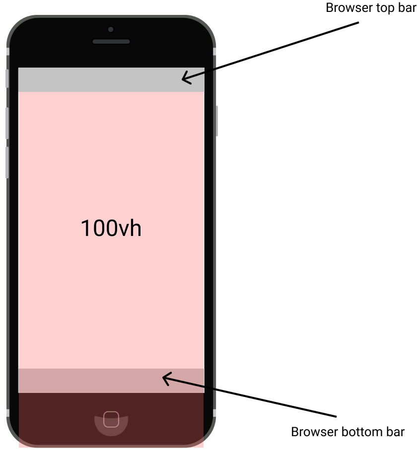
The web content it's outside the viewport although we used 100vh (the red opacity box with 100vh text).
The problem you have been receiving after adding the height: 100vh to mobile resolutions. It happens due to the calculation method which Safari and Chrome are using. Mobile devices calc browser viewport as ( top bar + document + bottom bar ) = 100vh . I had a hard time with 100vh when the page have to have a section filled the whole screen. After a couple of hours, I've found the solutions that I show you.
They are two solutions, the first needs JavaScript and CSS, the second solution required only CSS.
1. JS & CSS solution
Let’s get started first with the JS file:
appHeight function has sets new style property var( --app-height ) including current window height, --app-height it is necessary for next steps.
In the previous step I've created the reference --app-height , wrapping in the var() I've received CSS variable var(--app-height) . This variable is allowed to read values created by JS.
2. CSS solution (not recommend)
The last, but not the least solution is --webkit-fill-available , this solution works only on Apple devices, it won't solve the problem on Android devices. I don't recommend this solution, but it's worth showing.
Thank you for your attention! I’ll appreciate your feedback.
If you like this article, follow me on Twitter @MaciejDEV
Top comments (13)
Templates let you quickly answer FAQs or store snippets for re-use.
- Email [email protected]
- Joined Aug 14, 2022
thanks this is pretty easy. It's important to mention you'll want to run this on window resize events if you intend to allow your users to resize
- Location Lisbon, Portugal
- Work Designer at Expa
- Joined May 19, 2019
My approach is to disable the show/hide of the safari bars by preventing the body from scrolling. That way the content area height is constant.
- Location Poznań, Poland
- Work Front-End Developer at Tonik
- Joined Jun 12, 2020
Hi, It will work, but you have to remember about for example scrollTo and #anchors in this solution.
- Joined Jul 24, 2017
nice! thanks for posting, this is the most effective solve I've found.
something thing I noticed after implementing this solution is that it can trigger the fabled 'jumpy scroll', referenced in the stack overflow post I'm sure we all landed on before finding this post. stackoverflow.com/questions/371122...
as a workaround I created two css variables, one for the fixed "starting" height, and another "dynamic" height that is only used for the shopping cart, mobile menu and other fixed-position elements that require 100% screen height.
pasted below in case someone else runs into the same issue!
// set up css var for starting app height. this will not change on resize so we can avoid the jumpy scroll issue const appHeight = () => { const doc = document.documentElement; doc.style.setProperty('--app-height', ${window.innerHeight/10}rem ) }; window.addEventListener('orientationchange', appHeight); appHeight();
// set up css var for dynamic app height. this is just for the cart and mobile menu since they need to be fixed to size at all times.
const dynamicAppHeight = () => { const doc = document.documentElement; doc.style.setProperty('--dynamic-app-height', ${window.innerHeight/10}rem ) }; window.addEventListener('resize', dynamicAppHeight); dynamicAppHeight();
- Joined Jan 20, 2021
Hi, see: dev.to/admitkard/mobile-issue-with... Same issue, but again - on current Safari it is NOT working! Even on Android devices, I see the same issue.
So is there a working solution if the address bar moves away (no resize/switch to landscape etc.).
- Location Enschede, NL
- Work Entrepreneur at self-employed
- Joined Dec 8, 2020
I’m confused 🤣
So what are you saying? That the JS solution in this thread doesn’t work but the one you linked does?
- Joined Sep 18, 2019
Hi could you please also illustrate the problem? thanks!
Hi clivend,
Yes, sure I will illustrate the problem today/tomorrow. Thanks for letting me know what is missing!
- Joined Sep 22, 2021
This majorly helped with a college project of mine, thank you for writing this!
- Email [email protected]
- Location France
- Education Self Taught
- Work Junior Full Stack Developer
- Joined Jul 3, 2020
Actually, it's not only on safari. I had the exact same problem on chrome / brave and used the first solution for one of my latest projects ;)
Hi ips-coding-challenge,
yes, you are right, I missed issue with OnePlus what I had last year. 🙏
- Joined Apr 10, 2023
- Work Agency Owner
- Joined Jan 2, 2023
But how to set for only one page? This solution applies to all pages.
Thanks again.
Are you sure you want to hide this comment? It will become hidden in your post, but will still be visible via the comment's permalink .
Hide child comments as well
For further actions, you may consider blocking this person and/or reporting abuse

Understanding Single Responsibility Principle in TypeScript: A Quick Guide
Manas - Aug 26

WebAuthn PRF Extension, Related Origins & Passkey Upgrades
vdelitz - Aug 12

Como Integrar a API do ChatGPT com Node.js
Lucas Pereira de Souza - Aug 12

Flutter State Management Explained: How to Choose the Right Approach
Blup - Aug 12

We're a place where coders share, stay up-to-date and grow their careers.
Does Safari 15 finally fix viewport height?
Written by Luke Channings on June 11, 2021
The design for Safari 15 has been very controvercial, and has changed significantly since the beta that this article was based on Sadly, one of the casualties of the evolving design was the main thrust of this article: env(safe-area-inset-bottom) is no longer dynamically the height of the address bar in the final release.
TL;DR : No , but if you subtract env(safe-area-inset-bottom) from 100vh you'll get what you want .
Safari 15's UI is a radical departure from the previous version — and from web browsers in general — but does it fix the viewport height problem?
What is the viewport height problem again?
Mobile Safari has had problems related to 100vh not behaving like web developers expect 1 2 pretty much since the beginning. The main crux of the issue is that Mobile Safari's UI Chrome shrinks when you scroll, and expands again when you activate it. That means 100vh ("100% the height of the viewport") can't be a static number.
Let's start by understanding the definition of the vh unit 3 :
vh is defined as Equal to 1% of the height of the initial containing block . — Anthony Frehner
And here's the best explanation of the 100vh issues in Mobile Safari that I've seen so far,
The core issue is that mobile browsers (I’m looking at you, Chrome and Safari) have a “helpful” feature where the address bar is sometimes visible and sometimes hidden, changing the visible size of the viewport. Rather than adjusting the height of 100vh to be the visible portion of the screen as the viewport height changes, these browsers instead have 100vh set to the height of the browser with the address bar hidden. The result is that the bottom portion of the screen will be cut off when the address bar is visible, thus defeating the purpose of 100vh to begin with. — David Chanin , Avoid 100vh On Mobile Web
Let's put this new Safari to the test
I have a simple HTML page based on the example given in David's article. It has a header at the top and a button at the bottom, all wrapped in a 100vh container.

Safari's new floating address bar is displayed above our test button, which is more-or-less exactly the same behaviour as iOS 14.
So - Safari 15 does not change the behavour of 100vh 😢.
So what's the solution then?
It makes sense to me that the WebKit team wouldn't change the behaviour of the viewport unit, it's already well defined.
Do you remember when Apple introduced env() and safe-area-inset so that web developers could avoid their content being shown behind the notch 4 ?
Well in Safari 14, safe-area-inset-bottom is 0px whether the UI chrome is active or inactive, which is something that has annoyed me for a while.
safe-area-inset-bottom is 0px when the UI chrome is inactive in Safari 15 on iOS, and then the height of the collapsed chrome minus the height of the expanded chrome when the bar is expanded.
That means that to get a button to float at the bottom of the page, always above the UI Chrome, all you have to do is use calc(100vh - env(safe-area-inset-bottom)) .
Wrapping up
So not only does safe-area-inset-bottom work in Safari 15, it's animated !
I've been hoping that something to remedy the viewport height bug was coming since Jen Simmons (who joined the Safari / WebKit team in June 2020) was asking for feedback regarding viewport height issues.
Hey everyone who’s been frustrated that VH units in CSS don’t do what you need… can you describe your usecase? What layout are you creating? With which layout mechanism? What do you need? Screenshots & sample code appreciated. — Jen Simmons ( @jensimmons ) May 15, 2021
Have a feeling I’m going to be talking about Environment Variables a lot this week. They are really cool & supported! https://developer.mozilla.org/en-US/docs/Web/CSS/env() https://caniuse.com/css-env-function padding-bottom: calc(1rem + env(safe-area-inset-bottom)); -or- height: calc(100vh - env(safe-area-inset-bottom)); — Jen Simmons ( @jensimmons ) June 7, 2021
- https://bugs.webkit.org/show_bug.cgi?id=141832 ↩
- https://css-tricks.com/the-trick-to-viewport-units-on-mobile/ ↩
- https://github.com/w3c/csswg-drafts/issues/4329 ↩
- https://webkit.org/blog/7929/designing-websites-for-iphone-x/ ↩
One of my web projects requires the top section of the page to have a window’s height. Normally I use a CSS rule height: 100vh to do this if I don’t consider IE 8 or before because it is fast and easy. It works fine in most desktop browsers, but in mobile Safari the section is cut off the bottom (around 20px).
When playing with Safari, I found that mobile Safari has a very weird feature (looks cool though): it hides the tab bar in the bottom, and shrinks the address menu bar in the top when the user scrolls the page, causing the CSS rule fails.
As we can see from the following figures, the height of the viewable area before the bars are hidden is window.innerHeight . The return value is also 100vh in desktop browsers because most desktop browser won’t hide address bar when scrolling. The 100vh in mobile Safari, however, equals to the screen height minus the menu bar and the minified address bar (with 20px height).

In order to get that number in JavaScript, there is a window.screen.availHeight , which is not actually the available height because it still counts the minified address bar (20px). Therefore, the 100vh in mobile Safari should be window.screen.availHeight - 20 or window.screen.height - 40 . This is a ugly hack because we don’t know when Apple will change the height of the address bar to 24px or other.
Since there are a lot of users using mobile Safari today, this quirk practically makes 100vh useless, especially in the top section.
One solution is to set the height of the section using window.innerHeight in JavaScript, causing repaints, or set the height only in mobile Safari by adding a device detector ( e.g. ).
How To Go Full Screen On IPhone Safari

- Software & Applications
- Browsers & Extensions
Introduction
When it comes to browsing the web on your iPhone, the Safari browser offers a seamless and user-friendly experience. However, there are times when you may want to maximize your viewing area by going full screen. Whether you're engrossed in an article, exploring captivating visuals, or simply seeking a more immersive browsing experience, knowing how to go full screen on iPhone Safari can significantly enhance your browsing sessions.
In this article, we'll explore three simple methods to achieve full screen mode on Safari, allowing you to make the most of your iPhone's display and immerse yourself in the content you love. Whether you're using an iPhone 8, iPhone X, or any other model, these methods are designed to cater to a wide range of users, ensuring that everyone can enjoy the benefits of full screen browsing on Safari.
So, if you're ready to take your browsing experience to the next level and make the most of your iPhone's display real estate, let's dive into the various methods that will empower you to go full screen on iPhone Safari. Whether you're a casual browser , a dedicated reader, or someone who simply appreciates a clutter-free interface, these methods will equip you with the knowledge to seamlessly transition into full screen mode and elevate your browsing experience.
Method 1: Using the Full Screen Button
One of the most straightforward methods to go full screen on iPhone Safari is by utilizing the built-in full screen button. This feature allows you to maximize your viewing area with a single tap, providing a seamless transition into an immersive browsing experience.
To initiate full screen mode using the full screen button, follow these simple steps:
Open Safari : Launch the Safari browser on your iPhone and navigate to your desired webpage. Whether you're exploring the latest news, reading an engaging article, or browsing captivating visuals, ensure that you're on the webpage you wish to view in full screen.
Locate the Full Screen Button : Once you're on the webpage, look for the full screen button, which is represented by two diagonal arrows pointing outwards. This button is typically located in the bottom-right corner of the Safari interface, adjacent to the address bar.
Tap the Full Screen Button : With the full screen button in sight, tap it to seamlessly transition into full screen mode. As you tap the button, the Safari interface will fade away, allowing the webpage to expand and fill the entirety of your iPhone's display.
Enjoy Full Screen Browsing : Congratulations! You've successfully activated full screen mode using the full screen button. Now, you can immerse yourself in the content without any distractions, making the most of your iPhone's display real estate.
By utilizing the full screen button, you can effortlessly enhance your browsing experience, whether you're engrossed in an article, exploring captivating visuals, or simply seeking a clutter-free interface. This method offers a quick and convenient way to maximize your viewing area, allowing you to focus on the content that matters most to you.
So, the next time you're browsing the web on your iPhone Safari and wish to go full screen, remember that the full screen button is your gateway to a more immersive and visually engaging experience. With a single tap, you can unlock the full potential of your iPhone's display and elevate your browsing sessions to new heights.
Method 2: Using the Zoom Feature
Another effective method to achieve full screen on iPhone Safari involves leveraging the zoom feature. This approach allows you to magnify the webpage, effectively maximizing the content within the Safari browser and creating a full screen-like experience. While it may not directly activate a dedicated full screen mode, the zoom feature offers a practical alternative to enhance your viewing area and immerse yourself in the content.
To utilize the zoom feature for a full screen-like experience, follow these simple steps:
Open Safari : Begin by launching the Safari browser on your iPhone and navigating to the webpage you wish to view in a larger format. Whether you're reading an article, exploring images, or engaging with multimedia content, ensure that you're on the desired webpage.
Activate Zoom : Once you're on the webpage, use the standard pinch-to-zoom gesture on your iPhone's screen. This involves placing two fingers on the screen and either spreading them apart to zoom in or pinching them together to zoom out. By performing the pinch-to-zoom gesture, you can effectively magnify the content on the webpage, creating a full screen-like effect.
Adjust Zoom Level : After activating the zoom feature, you can adjust the zoom level to suit your preferences. Whether you prefer a slightly enlarged view or a more immersive experience, the zoom feature allows you to customize the content's size within the Safari browser.
Navigate the Zoomed Content : Once you've adjusted the zoom level, you can seamlessly navigate the zoomed content by scrolling and interacting with the webpage. Despite not activating a dedicated full screen mode, the magnified content offers an expansive and immersive viewing experience, allowing you to focus on the details without distractions.
By leveraging the zoom feature, you can effectively create a full screen-like experience within the Safari browser on your iPhone. Whether you're engrossed in textual content, exploring intricate visuals, or simply seeking a more immersive browsing experience, the zoom feature empowers you to maximize the viewing area and engage with the content in a more impactful manner.
So, the next time you wish to enhance your browsing experience on iPhone Safari, consider utilizing the zoom feature to magnify the content and create a full screen-like effect. With a simple pinch-to-zoom gesture, you can unlock a more immersive and visually engaging experience, allowing you to make the most of your iPhone's display real estate.
Method 3: Using the Reader View
When it comes to decluttering webpages and focusing solely on the core content, Safari's Reader View emerges as a powerful tool for enhancing the reading experience on your iPhone. By utilizing the Reader View feature, you can seamlessly transition into a distraction-free environment, allowing you to immerse yourself in the textual content without any visual disturbances. While not a traditional full screen mode, the Reader View offers a unique approach to maximizing the readability and focus on the essential elements of a webpage.
To leverage the Reader View for a more immersive and distraction-free browsing experience, follow these simple steps:
Open Safari : Begin by launching the Safari browser on your iPhone and navigating to the webpage containing the content you wish to explore in Reader View. Whether you're delving into an article, perusing a blog post, or engaging with textual content, ensure that you're on the webpage that aligns with your reading interests.
Activate Reader View : Once you're on the desired webpage, look for the Reader View icon located in the address bar. This icon typically resembles a series of stacked lines, symbolizing the consolidation of content for a streamlined reading experience. Tap the Reader View icon to activate this feature.
Enter Distraction-Free Mode : Upon tapping the Reader View icon, Safari will seamlessly transition into a distraction-free environment, presenting the textual content in a clean and easily readable format. The extraneous elements of the webpage, such as advertisements, navigation menus, and visual clutter, will be suppressed, allowing you to focus solely on the core text.
Customize Reading Preferences : Within the Reader View, you have the flexibility to customize your reading preferences. This includes adjusting the text size, choosing a preferred font, and altering the background color to optimize readability based on your personal preferences.
Immerse Yourself in the Content : With the distractions minimized and the textual content presented in a clean and organized layout, you can now immerse yourself in the material without any visual disturbances. Whether you're absorbing informative articles, exploring in-depth analyses, or delving into captivating narratives, the Reader View empowers you to engage with the content in a focused and immersive manner.
By utilizing the Reader View feature, you can effectively create a distraction-free and immersive reading environment within the Safari browser on your iPhone. While it may not activate a traditional full screen mode, the Reader View offers a unique approach to enhancing the readability and focus on textual content, ensuring that you can delve into the material without any visual distractions.
So, the next time you're seeking a more immersive and focused reading experience on iPhone Safari, consider utilizing the Reader View to declutter webpages and immerse yourself in the textual content. With a simple tap, you can unlock a distraction-free reading environment, allowing you to engage with the material in a more impactful and focused manner.
In conclusion, the ability to go full screen on iPhone Safari opens up a world of immersive and visually engaging browsing experiences. By exploring the three methods outlined in this article, users can seamlessly transition into a clutter-free and expansive viewing environment, allowing them to focus on the content that matters most to them.
Whether it's utilizing the full screen button for a quick and convenient transition, leveraging the zoom feature to magnify the content and create a full screen-like effect, or embracing the distraction-free reading environment offered by the Reader View, iPhone users have a range of options to enhance their browsing sessions.
The full screen mode not only maximizes the viewing area but also fosters a deeper connection with the content, whether it's absorbing informative articles, exploring captivating visuals, or delving into textual narratives. The seamless transition into full screen mode empowers users to immerse themselves in the material without any visual distractions, ensuring a more impactful and focused browsing experience.
Furthermore, these methods cater to a diverse range of user preferences, ensuring that individuals can tailor their browsing experiences to align with their unique needs and interests. Whether it's the desire for a clutter-free interface, a more immersive reading environment, or the need to maximize the viewing area for captivating visuals, the methods presented in this article offer practical and user-friendly solutions.
Ultimately, the ability to go full screen on iPhone Safari represents a gateway to unlocking the full potential of the device's display real estate. It transcends traditional browsing experiences, allowing users to engage with content in a more impactful and visually immersive manner.
As technology continues to evolve, the seamless integration of full screen browsing experiences on mobile devices underscores the importance of user-centric design and the empowerment of individuals to tailor their digital interactions to suit their preferences.
In essence, the methods outlined in this article serve as a testament to the versatility and user-focused nature of the Safari browser on iPhone , providing individuals with the tools to elevate their browsing experiences and immerse themselves in the content that resonates with them. Whether it's for work, leisure, or personal enrichment, the ability to go full screen on iPhone Safari enhances the way we engage with the digital world, fostering a deeper connection with the content that enriches our lives.
Leave a Reply Cancel reply
Your email address will not be published. Required fields are marked *
Save my name, email, and website in this browser for the next time I comment.
- Crowdfunding
- Cryptocurrency
- Digital Banking
- Digital Payments
- Investments
- Console Gaming
- Mobile Gaming
- VR/AR Gaming
- Gadget Usage
- Gaming Tips
- Online Safety
- Software Tutorials
- Tech Setup & Troubleshooting
- Buyer’s Guides
- Comparative Analysis
- Gadget Reviews
- Service Reviews
- Software Reviews
- Mobile Devices
- PCs & Laptops
- Smart Home Gadgets
- Content Creation Tools
- Digital Photography
- Video & Music Streaming
- Online Security
- Online Services
- Web Hosting
- WiFi & Ethernet
- Browsers & Extensions
- Communication Platforms
- Operating Systems
- Productivity Tools
- AI & Machine Learning
- Cybersecurity
- Emerging Tech
- IoT & Smart Devices
- Virtual & Augmented Reality
- Latest News
- AI Developments
- Fintech Updates
- Gaming News
- New Product Launches
- 12 Best Free AI Image Sharpeners in 2024 WebPCMobile
Sanjuksha Nirgude Soaring High with Robotics
Related post, unveiling the secrets of sls printing and its role in robotics, unleashing efficiency: the role of robotic process automation in industry 4.0, advancing cybersecurity: the integration of robotics with emerging sms phishing alert tools – innovations, challenges, and future perspectives, robotics redefining long-term investment horizons, bridging software development and robotics for enhanced automation, the role of robotics in cnc machining for large part production, related posts.
What Version Of Safari Do I Have


How To Search In Safari IPhone

How To Get Safari Back On My IPhone
Why Is Safari Not Working On My IPhone
How To Pin Tabs On Safari IPhone
How To Access Safari Menu
Where Do Downloads From Safari Go On IPhone
How To Sync Safari Tabs Across Devices
Recent stories.

12 Best Free AI Image Sharpeners in 2024 (Web/PC/Mobile)

OpenStack Backup and Recovery Software

Apple Wallet Availability in the PocketGuard App: Sync your Apple Card, Apple Cash, and Savings from Apple Card Accounts

5 Ways to Improve IT Automation

What is Building Information Modelling?

How to Use Email Blasts Marketing To Take Control of Your Market

Learn To Convert Scanned Documents Into Editable Text With OCR

- Privacy Overview
- Strictly Necessary Cookies
This website uses cookies so that we can provide you with the best user experience possible. Cookie information is stored in your browser and performs functions such as recognising you when you return to our website and helping our team to understand which sections of the website you find most interesting and useful.
Strictly Necessary Cookie should be enabled at all times so that we can save your preferences for cookie settings.
If you disable this cookie, we will not be able to save your preferences. This means that every time you visit this website you will need to enable or disable cookies again.

Handling iOS Safari toolbar for full height web content
Using the dvh unit for content that adapts to the viewport height.

I recently ran into an issue where I had some content to display that spans the full height of the device and the code was using height: 100vh to achieve the same. When testing on iOS Safari, you'll see there's an issue with this:

As seen in the above screenshots from Safari on an iPhone, using 100vh introduces a scrollbar when the Safari toolbar is visible and cuts off the bottom content.
This is because the vh unit computes the viewport size without factoring in the toolbar height. Thus, the user either needs to scroll down for the address bar to automatically disappear or manually hide it for all content to be displayed.
Unfortunately, there's no way to programmatically hide the toolbar on iOS Safari using JavaScript at the time of writing. However, there is a solution for the content to adapt with the toolbar using the dvh unit.
The dvh unit stands for dynamic viewport height and enjoys support from all the latest browsers . This unit factors in the viewport that's truly visible to users.
In case, you want to work with earlier versions of browsers that don't support dvh , you can make use of the @supports CSS rule .
Here's an example of how you'd set up a class called full-viewport-height that adapts according to the browser viewport using the dvh unit but falls back to vh if the browser doesn't support it:
Using this full-viewport-height on our container now, the result looks as expected:

The content using 100dvh now spans the whole height of the web page even if the Safari toolbar is visible and on scrolling down or hiding it, the content adapts to fill the whole page making sure your content always covers the viewport as expected.
You can find the code sandbox for the above examples at vh-sandbox and dvh-sandbox .

Ben Borgers
How to fix Tailwind CSS’s h-screen on iOS Safari
December 24, 2021
Safari on iOS behaves strangely around 100vh heights in CSS: it defines 100vh to include the part of the page behind the URL bar, meaning that it overflows off the page a little bit when the URL bar is showing.
This can be annoying since you think your page will be exactly as tall as the screen, but instead it overflows a bit.
Since Tailwind CSS’s .h-screen class uses the measurement 100vh under the hood, it’s affected by this problem.
Luckily, there’s a solution using pure CSS. You can add this bit of extra CSS to your app to make .h-screen behave as you’d expect:
The @supports media query makes sure that this CSS only affects Safari, and then instead of 100vh , we use the browser-specific unit -webkit-fill-available . This is a height defined by the available space, which on iOS Safari only includes the visible area, without the area behind the URL bar.
height:100% is not 100% after rotating device
I've observed some strange behavior that started around iOS 12.2 and continues through iOS 13.x. If you load even a very simple web page into Safari that contains a div with a 100% height, then the result is correct and you get a full-screen div. If you rotate the device to landscape then it resizes and the div still fills the screen. But when you rotate it back to portrait, an empty white area appears at the bottom of the screen, and there doesn't appear to be a way to make it go away.
I suspect this has to do with the change Apple made around the iOS 12.2 timeframe, where when a phone is rotated to portrait, the URL bar shrinks and the navigation bar is hidden. When this happens, the content area is in effect larger than it was before, but it's like CSS doesn't know about it, so a height of 100% represents the height as if the URL bar was larger and the nav bar was present.
This HTML is enough to show the issue:
Viewing that page on an iPhone with iOS 12.2+ will look fine, so rotate to landscape and then rotate back to portrait. A white area will appear at the bottom. I'm told that on larger-style iPhones, this only occurs if it is the only tab open -- otherwise, iOS never hides the navigation bar. On my 6s, it happens every time.
Has anybody seen this before? Any ideas for working around it? It is making all of our web apps "scrunch up" after users rotate their devices, with no obvious way to programmatically fix it!
I am also experiencing this issue in my applicaiton. The div that is shortened is in the middle of the screen, creating a white gap, im thinking it's the 100%. Only an issue on iOS devices.
I also have this issue. Its not an option in my case, but in case it is in yours, removing the viewport meta tag seemed to fix it.
It is not a bug. Refer to my Stackoveflow question here: https://stackoverflow.com/questions/56622926/safari-viewport-bug-issues-with-fixed-position-and-bottom-or-top

Using Bottom Tab Bars on Safari iOS 15
Jun 17, 2021 (Updated Sep 23, 2021)
Apple recently announced the latest version of Safari on iOS 15 with a completely new design featuring a bottom floating tab bar. What does this mean for web developers and designers?
Safari on iOS has had a problem for a long time when it comes to building websites and web apps with bottom-aligned navigation due to the browser toolbar's dynamic height. As you scroll the toolbar disappears making any element that is fixed to the bottom of the screen look great, but as soon as you try to tap any link inside the browser toolbar appears again.
Sorry, your browser doesn't support embedded videos.
This makes for a really poor UX so designers and developers have mostly resorted to user "hamburger" menus instead. This is a shame as bottom tab bars increase discoverability by not hiding links behind a tap and are also easier to reach one-handed on todays large mobile devices.
Updates with Safari 15
Apple reverted some of these changes in the final iOS 15 release. The user can now choose between the old UI (top bar) or the new one. If they choose the new bottom bar UI it does not float as much greatly improving overlap issues. While you might not need safe areas anymore if you're lucky, I would still recommend to implement it as I've seen it cause issues anyways.
The new Safari 15 now has a tab bar floating at the bottom of the screen. At first it might seem like this makes it even harder to create tab bar navigations, and by browsing the web using iOS 15 it's easy to spot issues like this:
Fixing Tab Bar Overlap with Safe Areas
Thankfully solving this issue is very easy by using the env() CSS function together with safe-area-inset-bottom . This API was shipped with iOS 11 making it possible to customize how websites render when using devices with a notch. By inspecting pinterests code we can see that their tab bar has a fixed position anchored to the bottom, the relevant parts look something like this:
To respect the safe area and make sure that nothing from the browser UI overlaps let's add another bottom property with env(safe-area-inset-bottom) as a value. This function works like a CSS variable, returning the minimum amount of inset needed to keep your UI from overlapping with the browser's. We keep the old style rule as a fallback browsers that do not support it:
Now when scrolling nothing overlaps:
Be sure to use env() every time something is anchored to the bottom of the screen or overlap will likely appear. env() can also be combined with css calc() or min() and max() , so if your design needs more padding you can add it like this:
You can learn more about respecting the safe-area in this excellent article published on the webkit blog or Apple's WWDC session called Design for Safari 15 (Relevent part starts around 13 minutes in).
The best way to see if you got it right is to use a physical device with iOS 15, but if you don't have access to one you can download the Xcode 13 beta from Apples developer portal and use an iOS 15 simulator by going to Xcode > Open Developer Tool > Simulator
Tab Bar UX in iOS 15
Remember the issue in previous versions of Safari where you had to click twice when using bottom tab bars? Once for showing the safari toolbar and another tap for actually triggering your link? That is no longer an issue 🙌. Safari 15 now respects and follows links or buttons, which is a big improvement! Check out how much better Twitter's tabbar works when switching tabs on Safari 15:
Even if tab bars now technically work better than before we still have to consider the design and UX to create something that people understand and that looks good. The browser UI is now very bottom-heavy and placing more actions next to it might feel cluttered. What do you think? Let me know on twitter @samuelkraft .
I'm excited to see how everyone adapts to the new UI and if we will see a return of tab bars on the web or not.
Get an email when i write new posts. Learn animation techniques, CSS, design systems and more
Related posts

Dec 18, 2021

Dec 15, 2021

Sep 07, 2021

IMAGES
VIDEO
COMMENTS
Set the CSS height of your root container element (let's call it rootElement) to the height of the view port:.root-element { height: 100vh; } Then, when the page renders, run this code to update rootElement height to the viewport height minus the size of the browser UI bars (for example, on iOS Safari: top address bar, bottom navigation bar…):
Safari for iOS was one of the first mobile browsers to update their implementation by choosing to define a fixed value for the vh based on the maximum height of the screen. By doing so, the user would not experience jumps on the page once the address bar went out of view. ...
I don't think there's a property of window that corresponds to the new dvh (Display Viewport Height) CSS unit.. From a practical standpoint, I wanted to set my (dynamically-created) <canvas> to 100dvh via JS when the page loads. This ensures that when the user scrolls on iOS Safari and the browser chrome is hidden, the canvas is already the full height of the window.
1. change the height every time the bar hides and shows. 2. make the viewport height constant, and have the button bar cover part of the viewport. They opted for a constant height to avoid ...
Because iOS runs on devices with different screen resolutions, you should use the constants instead of numeric values when referring to the dimensions of a device. ... Safari on iOS infers the height by maintaining a ratio equivalent to the ratio of the visible area in either orientation. Therefore, if the width is set to 980 and the initial ...
The problem you have been receiving after adding the height: 100vh to mobile resolutions. It happens due to the calculation method which Safari and Chrome are using. Mobile devices calc browser viewport as ( top bar + document + bottom bar) = 100vh. I had a hard time with 100vh when the page have to have a section filled the whole screen.
Overview. Responsive Design Mode lets you quickly preview how your webpage responds to changes in width and height, as well as differences in the pixel ratio of displays. Use Responsive Design Mode to ensure all visitors to your webpage get a great experience, no matter the size of their screen.
Well in Safari 14, safe-area-inset-bottom is 0px whether the UI chrome is active or inactive, which is something that has annoyed me for a while. safe-area-inset-bottom is 0px when the UI chrome is inactive in Safari 15 on iOS, and then the height of the collapsed chrome minus the height of the expanded chrome when the bar is expanded.
The 100vh in mobile Safari, however, equals to the screen height minus the menu bar and the minified address bar (with 20px height). In order to get that number in JavaScript, there is a window.screen.availHeight, which is not actually the available height because it still counts the minified address bar (20px).
So with element inspector open, then, In Safari, when you hover over an element, it shows the pixels. And you can get it to show the pixels while you resize a window, to do that you click the crosshair icon in the inspector, then hover over the background so it shows the pixels, then move the mouse across so it still shows the pixels, and ...
Method 1: Using the Full Screen Button. One of the most straightforward methods to go full screen on iPhone Safari is by utilizing the built-in full screen button. This feature allows you to maximize your viewing area with a single tap, providing a seamless transition into an immersive browsing experience. To initiate full screen mode using the ...
When testing on iOS Safari, you'll see there's an issue with this: As seen in the above screenshots from Safari on an iPhone, using 100vh introduces a scrollbar when the Safari toolbar is visible and cuts off the bottom content. This is because the vh unit computes the viewport size without factoring in the toolbar height. Thus, the user either ...
Solution 1: CSS Media Queries. This method, albeit not entirely elegant, is simple and easy to implement. Simply target all iOS devices with specific device-width and heights. Here is a code ...
Safari on iOS behaves strangely around 100vh heights in CSS: ... {.h-screen {height: -webkit-fill-available;}} The @supports media query makes sure that this CSS only affects Safari, and then instead of 100vh, we use the browser-specific unit -webkit-fill-available. This is a height defined by the available space, which on iOS Safari only ...
height:100% is not 100% after rotating device. I've observed some strange behavior that started around iOS 12.2 and continues through iOS 13.x. If you load even a very simple web page into Safari that contains a div with a 100% height, then the result is correct and you get a full-screen div. If you rotate the device to landscape then it ...
Safari on iOS has had a problem for a long time when it comes to building websites and web apps with bottom-aligned navigation due to the browser toolbar's dynamic height. As you scroll the toolbar disappears making any element that is fixed to the bottom of the screen look great, but as soon as you try to tap any link inside the browser ...
7. As I understand it, the window.innerHeight should return the size of the viewport without the browser chrome (address bar, navigation, tabs, etc.). But this doesn't seem to be the case in the latest version of iOS13. Instead there are two problems: ( Sometimes* too small in portrait) If you rotate from portrait mode to landscape mode with no ...
Switch to 'Single Tab mode' (address bar at top) in Safari settings. Scroll the page up and down to make the address bar show and hide. Notice the box will have bottom padding only when the home screen indicator is visible (the white bar at the bottom of the screen). answered Sep 9, 2021 at 0:54. Simon_Weaver.
I have a React based pwa with a textarea input. On my own device (Andorid chrome and FF), tapping the textarea pops up the onscreen keyboard and it pushes all content upwards as if it is adding margin-bottom: <height of keyboard>px.This is default behavior which I want to retain.